
Demine, a fintech innovator, offers seamless door-to-door services for digital currency mining. We streamline your journey into cryptocurrency with these key services:
Cryptocurrency mining agency.
Comprehensive hosting solutions, covering procurement, transport, and maintenance of mining equipment.
A straightforward, monthly service fee for hassle-free financial planning.
I was the lead of a team of 3 designers and 1 pm. We were designated by Demine to design two products: an engaging landing page and a personal dashboard which demonstrates the income & order-related details of cryptocurrency.


-- In the early stages of our product development, our team collaborated closely with the co-founders and participated in the design process.
-- Recognizing that our product lacked brand recognition in the market, we decided to prioritize the creation of an engaging landing page to attract user participation.
-- Additionally, we focused on designing the product functionalities to strongly encourage user referrals.
-- Traditional methods of cryptocurrency mining are often complex and cumbersome, involving the installation of various drivers and equipment on computers.
-- Our analysis of competitors and interviews with potential users revealed that many are discouraged by this intricate process, especially those without a financial background.
-- The challenge we faced was how to reduce the cognitive load for users, simplifying the process of mining cryptocurrency and effortlessly enabling them to see the returns on their managed wallets.
--Simplicity: Quick, effortless revenue tracking.
-- Clarity: Clear graphs replace complex jargon for easy understanding.
-- Intuitive: Intuitive user flows and interfaces, prioritizing essential information to facilitate easy onboarding.

INSIGHTS
Prominent CTAs: A prominent Call-to-Action (CTA) button can significantly boost conversion rates.
Captivating Hero image: An captivating Hero Image creates a sense of storytelling, grabbing attention.
Consistent UI: Consistent UI design exudes a professional and sophisticated appeal.
Start with 'WHY'
“People don’t buy what you do, they buy why you do it.” - Simon Sinek


In designing the landing page, we initially collaborated closely with clients to reflect their goals and business impact. Our wireframes were client-driven. However, we realized the importance of user interaction and feedback, which were initially overlooked. Recognizing this, we shifted our focus from client requirements to user-centric design, aligning our approach with user needs and preferences after discussing with our clients.
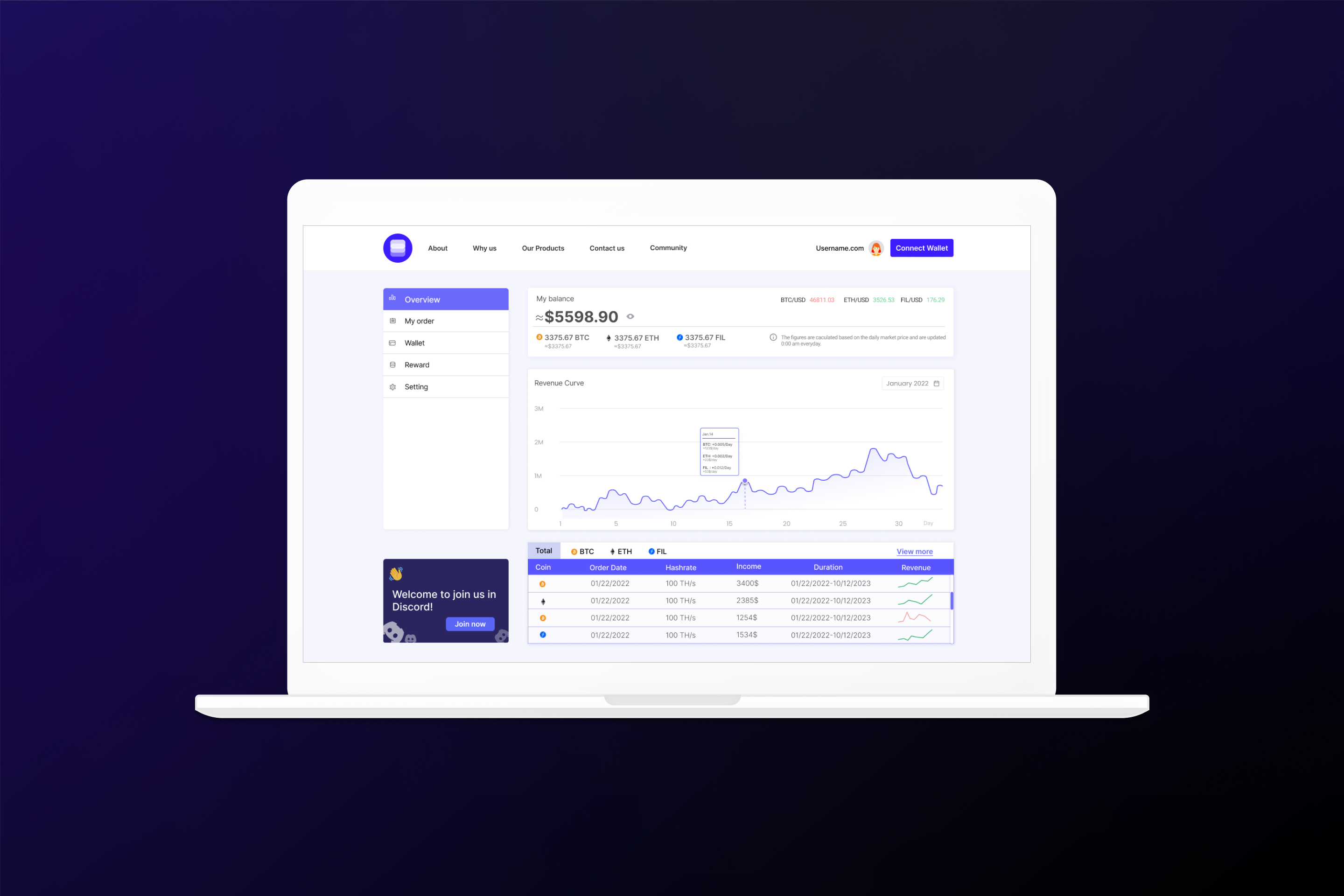
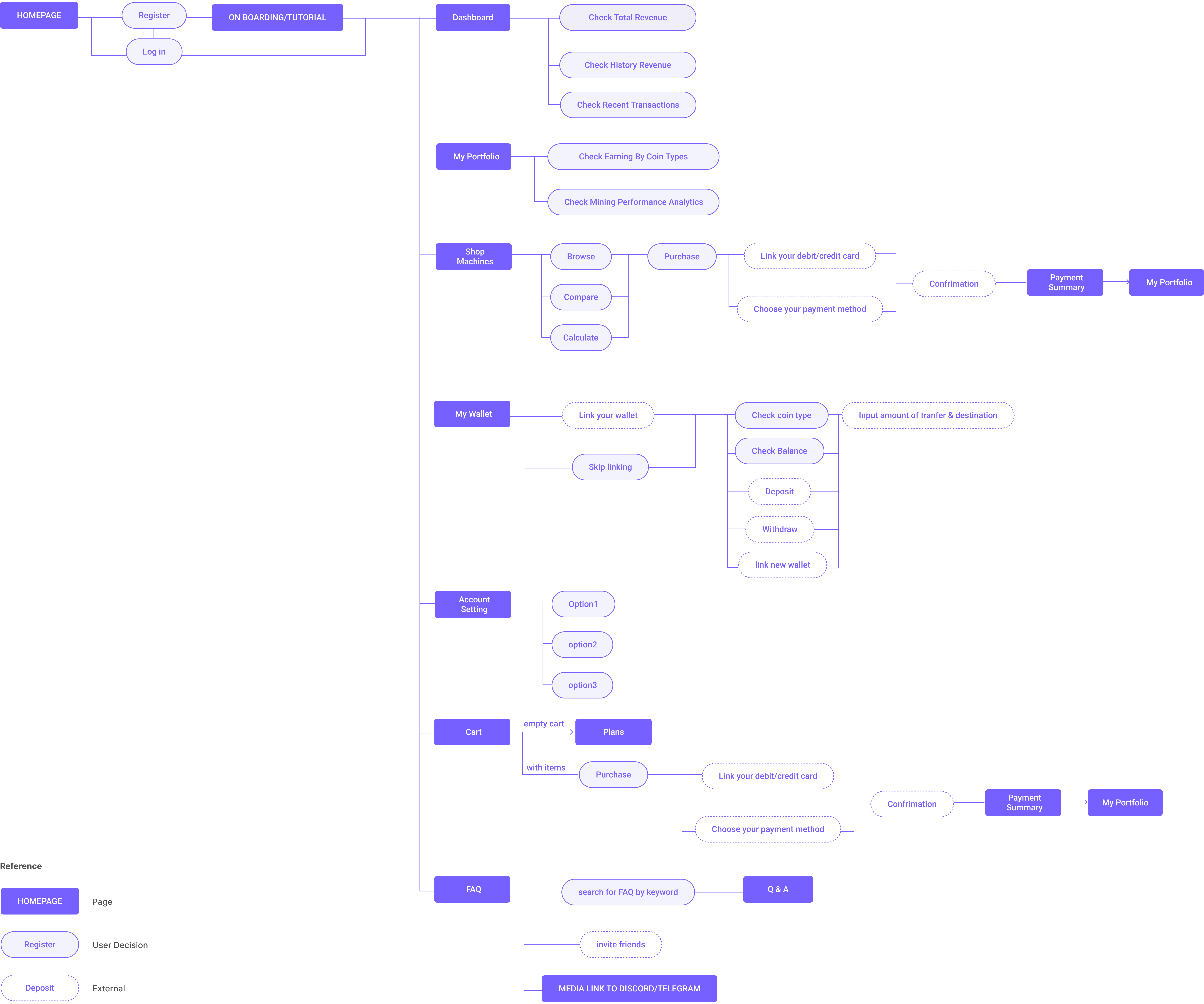
Our next step involves designing a personal dashboard to show users their earnings and profits from crypto mining investments. Our challenge lies in identifying the essential data users need and filtering out irrelevant information. This process will guide us in defining key features and establishing an effective information hierarchy.
We researched the market's leading dashboard designs to understand their prioritized features. Our goal is to ensure our design incorporates all essential features that are most valued by our customers.

To better understand users, we created a survey and conducted semi-structured interviews with potential users.


INSIGHTS
Complexity in Steps: Current market products have overly complex steps, deterring novice users.
Challenging Onboarding: The use of jargon familiar only to industry insiders decreases user-friendliness.
Strategy of Data Visualization: To address these pain points, we plan to implement a data visualization strategy. This approach aims to reduce cognitive load for users by presenting information in the most intuitive way possible.

We executed several task-based usability tests to validate our design decisions in both Low-Fidelity (Lo-Fi) and High-Fidelity (Hi-Fi) phases. Through one-on-one interviews using user research methods, users were given three specific tasks to complete: interacting with the User Dashboard, processing actions on the Order Page, and managing an external Wallet.
“ It is a bit confusing how you guys get these numbers calculated.’’
“ Actually the curve would be more flat and I’m afraid the curve would not be looking so pretty.’’
-- User Jim Kim
✅ Check overall earnings and revenue trends.
✅ Comprehend the process.
⭕️ Understand the meaning of numbers and charts on the dashboard.
We opted for a sidebar navigation to enhance the clarity of our IA and decrease user cognitive load. This choice also aims to make our design more scalable for future development phases.
✅ A clearer hierarchy of information to users
✅ More scalable for future phases
⭕ Not all information can be presented on a single concise page

Users might be less sensitive to the quantity of their cryptocurrency than its equivalent in USD. We emphasize the figures users are most likely to be concerned with.
✅ Display in USD for intuitive understanding
✅ More familiar and relatable financial reference


Users noted the curve wasn't prominent enough, and in follow-up interviews with the cofounder, we learned that data visualization is our innovation and strength. It's crucial in quickly conveying information to users, so we need to find ways to emphasize it.

"The curve is too flat, I can’t see any differences between them."
“ It is a little hard to understand what the order pages for the first time, but get better the second time.’’
-- User Mia Ma
✅ Examine each transaction meticulously
🤯 Gain an in-depth understanding of the order page content
⭕️ Experience the intricately designed order page through careful

During usability testing, we noted challenges in differentiating revenue curves on a single page. Our solution was to assign each curve to its own collapsible card, improving visibility and reducing clutter. This design allows users to expand cards for detailed views or collapse them for simplicity, thereby enhancing the ease of comparing specific orders.

"In version 1.0, implementing pop-ups is more cost-effective from an engineering standpoint.”
"Since MetaMask often appears in a pop-up format, this approach ensures consistency."
-- Engineer Alex

After discussing with the engineering team, we learned that using pop-ups for external wallet linking is cost-effective. Both separate pages and pop-up windows require secure and reliable interaction with the MetaMask API. Since MetaMask often appears in a pop-up format, this approach ensures consistency.
✅ Use pop-up windows to help users focus on wallet linking steps.
✅ Pop-up windows are technically simpler and faster to load.
⭕️ Pop-ups might seem less formal compared to separate pages, possibly causing a slight sense of insecurity.

Effective teamwork balances diverse ideas while embracing collective goals, demanding open-mindedness and strong cooperation. True leadership integrates each team member's unique strengths into the project, guided by shared passion. This collaborative approach fosters an environment where individual talents contribute to the overall success of the project.
Genuine interest in a project drives comprehensive information gathering and attention to detail, accelerating learning and enhancing outcomes. However, designers must remember that real-world user behavior often deviates from predictions. This makes usability testing crucial, ensuring the product truly meets user needs and expectations. By combining passion-driven detail orientation with rigorous user testing, we create products that not only meet our design vision but also resonate with our target audience.