


The Brand Kit is a systematic platform tool designed to facilitate collaboration within teams. It allows members to easily share a set of elements such as logos, images, and colors, streamlining the creation of branded AI videos. I was this project's owner and the only designer at that time, and I worked very closely with HeyGen's cross-functional teams.

HeyGen, an AIGC company based in Los Angeles, effortlessly produces studio-quality videos with AI-generated avatars and voices. When I joined, HeyGen was undergoing a transition to a B2B SaaS business model. During this period, the Brand Kit emerged as a powerful product to attract corporate users and facilitate the company's business transformation. Launched alongside Workplace and Teams, the introduction of the Brand Kit nearly doubled the number of HeyGen's early enterprise users.


During the design process, I primarily adopted the Double Diamond model and a User-Centered design philosophy. During these four stages, I worked closely with the product manager and front-end and back-end engineers to ensure smooth progress and maintain the product's quality at each step.

During the early phase of the project, I've participated in numerous enterprise calls alongside the Project Manager. Below are some of the use cases from interviewing customers through enterprise calls:

1. Strategy: Consider offering the Brand Kit as a paid feature within Teams.
2. Scope: Ensure the smooth launch of at least 4 core features: Logos, Colors, Fonts, and Pictures.
3. Structure & Skeleton: Consider highlighting the Brand Kit in the main navigation bar to enhance visibility.
4. Surface: Consider a minimalist interface design and in-place editing for a streamlined user experience.


This is my first experience with B2B product design, and leading this project presented numerous challenges. These included the product design itself, collaboration and communication with cross-functional teams, as well as personal learning and growth challenges. I was fortunate to face these challenges and overcome them.

Incorporate BrandKit and Teams into Space management, enabling collaboration with view/edit permissions controlled by Super Admins through the control panel.


Maximize product features to fully meet enterprise user needs, while minimize complexity in the interface and user interactions.


Frequent communication. Conduct design reviews and stand-up meetings with PMs and engineers throughout all design phases to confirm feasibility and project alignment.
Face challenges and start fast. Tackled complex user flows and design elements by breaking them down, consulting experts, and iterating with user tests, progressively refining towards the desired result.
Effective project management. Learned the value of clear, transparent scheduling (e.g., Gantt charts) to enhance team collaboration.


✅ Users can concentrate more on their tasks through the format of pop-up windows.
⭕️ The whole user flow of creating a BrandKit can be easily interrupted.
⭕️ Inconvenient for users to complete each step of creating a BrandKit.
In a round of user testing, we found that the static modal approach for uploading assets was not the most user-friendly option. As a result, we changed the interaction method for some elements (Avatars, Colors, and Fonts) to an easier in-place editing approach.


✅ Users have a smoother and more convenient experience when uploading assets, saving time.
✅ The user interactions are more flexible, and the overall operation is more intuitive.
⭕️ A minor tradeoff is that we sacrificed some focus and interface simplicity for the elements.

During user testing, some found the BrandKit's empty state confusing, and the interface seemed too barren. To solve this, I added more clear and user-friendly icons and prompts to guide users in creating their first BrandKit.

✅ Icons enhance user intuition for BrandKit's use.
✅ Brief prompts also facilitate easier user onboarding.
⭕️ In terms of UI, it reduces interface simplicity.

During a round of user testing, I noticed that using certain BK features in the video editor interface required switching back to the BK interface, wasting time. After discussing with cross-functional teams, we decided to integrate BK's some features like colors and fonts throughout the whole product for efficiency.

✅ Introduce a dedicated color management panel to facilitate user editing.
✅ Incorporate BrandKit colors into the editor's global color palette for convenient use.


✅ Place BrandKit's fonts in a dedicated, easily manageable section within the sidebar.
✅ Incorporate BrandKit fonts into the global font picker of the product editor.

During Beta testing, some users reported that they wanted to add their own fonts for customization. With support from my product manager, we're tackling technical challenges to enhance the product, deciding on the types of fonts users can upload and how to manage them.


✅ Significantly enriched font options for users.
⭕️ Incorporating user-uploaded fonts introduces complexities such as copyright verification or font family management.

We ultimately chose option three (the rightmost) for the font management card over the first two options:
✅ We categorized by Font Family instead of individual fonts for a more cohesive approach.
✅ We disallowed font uploads in this sub-level management panel to avoid complicating the user flow.
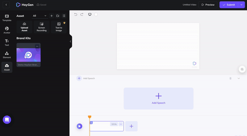
In subsequent iterations, to enhance user understanding of BrandKits and promote HeyGen's brand culture, we've decided to preset a HeyGen BrandKit in every user's account by default. This allows users to easily edit and utilize the BrandKit, facilitating a smoother introduction to the concept and our brand identity.
Promoting Brand Culture While Enhancing User-Friendliness

✅ Icons enhance user intuition for BrandKit's use.
✅ Brief prompts also facilitate easier user onboarding.
At HeyGen, I collaborated with Melon, and helped designed our default BrandKit at that time to improve user engagement and brand recognition. Involved in every design aspect—logo, colors, image style—I aimed to forge a strong brand identity.


From the initial wireframes to the fully developed design drafts, this journey involved numerous review meetings and revisions with frontend and backend developers. It taught me to distinguish between feasible functionalities and interactions versus those that are merely designers' wishful thinking. This engaging learning process provided a real glimpse into the transformations a product undergoes from design to development. It underscored the importance of maintaining proactive communication with product managers and developers throughout the project.

I also played a significant role in the development of the HeyGen 4.0 Design System during the process of this project. This endeavor was not just about building a framework; it was about crafting a language of design. By standardizing over 22 UI components, and meticulously developing the color system, illustrations, and icons, I contributed to a narrative of coherence and elegance in design. This system became a cornerstone for cross-organizational teams, impacting the way they communicate and collaborate. It wasn't just a project; it was a transformation of our design culture, fostering unity and efficiency across the company.
During my internship, a key learning was how to develop practical products. One trick is to think like an engineer: learn and understand CSS box model concepts. Applying this mindset while sketching prototypes is crucial. Figma's auto layout feature is an excellent tool that facilitates this kind of thinking, allowing us to optimize our designs effectively.